
Using Acrel Meter Data to Compare Production Shifts and Output
A factory can make the same number of parts on two shifts and still use very different amounts of electricity. That gap is where useful questions start. Did one shift run longer? Was a compressor left on during a break? Did a machine spend too much time idling? Was product mix different?
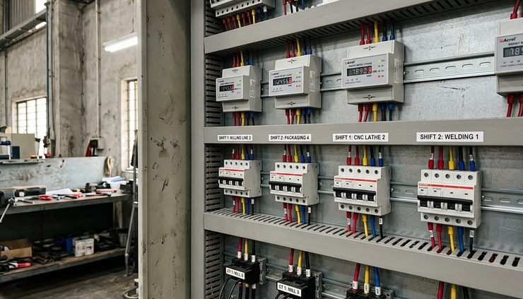
Monthly utility bills cannot answer those questions. They show the total, not the pattern. To compare shifts fairly, electricity records need to sit beside two other records: operating hours and production output. Acrel meters can supply the electrical side of that picture, while equipment supplied by ProSense Instruments can help make the data available to operators, maintenance teams, and production managers.
Why shift-level electricity data is more useful than the monthly bill
The utility bill is useful for cost control, but it is too broad for production analysis. It usually covers the whole site, all loads, all shifts, and all non-production use. That makes it hard to connect energy use to what happened on the floor.
Shift-level metering gives a clearer view. It can show:
How much energy a line used during each shift
Whether peak demand happened during start-up, production, or cleaning
How much power equipment used while it was supposed to be idle
Whether a process used more energy per unit than normal
Whether changes in staffing, product type, or setup time affected energy use
The aim is not to turn energy data into a blame tool. A fair comparison needs context. A night shift making a heavier product may use more electricity for valid reasons. A day shift with several changeovers may use more energy per unit because the line was not running steadily. Meter data becomes useful when it helps explain the difference, not when it is viewed on its own.
A good shift comparison normally needs three records lined up by time:
Record | What it shows | Typical source |
Electricity use | kWh, demand, current, voltage, power factor | Acrel meter |
Operating time | When a line or machine was ready, running, stopped, or idle | PLC, run signal, relay, input module, machine controller |
Production output | Units made, batches completed, weight processed, or rejects | Counter, PLC, MES, operator entry, batch record |
When these records share the same shift times, the plant can compare performance in a way that is much more useful than looking at energy alone.
Start by deciding what you want to compare
Meter selection should start with the question the data needs to answer. A main incomer meter, a line-level meter, and a machine-level meter all tell different stories.
A site-level meter can show total demand and confirm whether the whole plant is moving in the right direction. It will not show whether Line 2 used too much energy during the late shift.
A distribution-board meter can separate one area from another. That suits plants with several lines, departments, or utility loads such as compressed air, chilled water, or extraction.
A machine-level meter gives the most detail. It is useful for high-energy assets, bottleneck equipment, or machines where idle running is common. It also helps when the same product can run on different machines and the team wants a fair comparison.
Before choosing the meter, define the comparison level:
Comparison goal | Best metering point | Useful result |
Compare total plant energy by shift | Main incomer or sub-main | kWh and peak demand for each shift |
Compare production lines | Feeder to each line | kWh per line, per shift, per unit |
Compare a high-energy machine | Feeder to the machine | Idle load, running load, kWh per cycle |
Compare utilities against production | Compressor, pump, chiller, extraction fan | Energy use per operating hour or per output unit |
Check electrical quality issues | Board or machine with sensitive drives | Voltage, current balance, power factor, events where available |
This step avoids a common mistake: installing a meter where it is easy rather than where it answers the production question.

Choose Acrel meters around load type, data needs, and access method
Acrel offers metering options for different electrical panels and machine loads. The right choice depends on the supply, the current rating, the installation space, and the type of data needed.
For a small single-phase load, a compact DIN rail energy meter may be enough. For a three-phase machine or distribution board, a multi-function meter with current transformer inputs is often more suitable. For a high-value process or a load with drives and motors, it may help to collect more than simple kWh.
The key features to check are practical ones.
Supply type and load size
Confirm whether the load is single-phase or three-phase. Check the supply voltage, maximum current, and whether the installation needs direct connection or CT measurement. Larger loads normally use CTs so the meter can measure current without carrying the full load.
Data points
At minimum, shift analysis needs cumulative kWh. For better diagnosis, collect power, current, voltage, power factor, and sometimes frequency. Demand values are useful when tariffs or electrical capacity matter.
Communication
For regular reporting, choose a meter with a communication output that matches the site system. Common options include RS-485 with Modbus RTU, pulse output, or connection through a gateway. Ethernet or cloud-connected arrangements may suit some sites, depending on the wider equipment package.
Panel format
DIN rail meters suit control panels and distribution boards with rail space. Panel-mounted meters suit switchboards where operators need to see values locally. The physical choice matters because a difficult installation often leads to poor maintenance later.
Inputs and alarms
Some metering arrangements can accept status signals or provide alarm outputs. That can help connect energy records with run signals, trip states, or demand warnings. The exact feature set depends on the chosen model, so it should be checked before ordering.
ProSense Instruments can help match the Acrel meter choice to the site architecture, especially where the meter needs to feed data into a gateway, PLC, display, or reporting system. That matters because the meter is only one part of the measurement chain. The data still has to reach the place where people will use it.
Access the data in a form that production teams can use
Installing a meter is the easy part. The value comes from collecting the readings regularly and storing them with the right time stamps.
A practical setup might use Acrel meters connected over RS-485 to a data logger, gateway, PLC, or monitoring device supplied by ProSense Instruments. From there, the data can be displayed locally, passed to a supervisory system, exported for reports, or stored for later analysis.
The exact path depends on the site, but the principle is the same:
The meter records electrical values.
A connected device reads those values at set intervals.
The system stores the readings with date and time.
Shift times and production totals are added from the production record.
Reports calculate the values that matter.
For shift comparison, the polling interval does not always need to be extremely fast. A one-minute or five-minute record may be enough for kWh, demand trends, and operating patterns. Faster sampling may be useful for short machine cycles or fault diagnosis, but it creates more data to store and manage.
Accuracy also depends on time alignment. If the production counter closes at 14:00 but the meter record is taken at 14:05, the comparison will drift. The shift boundary should be clear and consistent. Where possible, use the same clock source for the meter-reading equipment, production system, and reporting tool.

Turn raw readings into fair shift comparisons
Raw kWh totals are a good start, but they do not tell the full story. A shift that ran for eight hours will usually use more energy than a shift that ran for six. A shift that made more output may use more energy while still performing better.
The basic calculation is simple:
`Shift kWh = meter reading at shift end - meter reading at shift start`
From there, compare energy against time and output.
Measure | Calculation | What it tells you |
kWh per shift | End kWh minus start kWh | Total electricity used during the shift |
kWh per operating hour | Shift kWh divided by run hours | Energy intensity while equipment was available or running |
kWh per unit | Shift kWh divided by good output | Energy cost of production output |
Idle kWh | Power used during non-production periods | Waste from equipment left running |
Peak demand | Highest demand during the shift | Capacity pressure and possible tariff impact |
The most useful number is often kWh per good unit. It links electricity use to actual output and reduces the risk of penalising a shift just because it produced more.
Still, use it carefully. Scrap, rework, warm-up time, cleaning, and product mix can all affect the result. A short production run after a cold start may show poor kWh per unit because the machine used energy before saleable output began. That does not mean the shift performed badly. It means the report should show start-up, run time, and output together.
A good shift report might include:
Start and end meter readings
Total kWh
Run hours
Planned stop time
Unplanned stop time
Good units or good weight
Rejects or rework
kWh per good unit
Peak demand
Notes on product type or changeovers
The notes matter. A number without context can send the team in the wrong direction.
Look for patterns that point to real problems
Once the same report is produced shift after shift, patterns appear. Some are simple. Others need a closer look.
A machine may show a high base load during breaks. That can mean heaters, pumps, conveyors, extraction, or hydraulics remain on when production has stopped. If the process allows safe shutdown or standby, that becomes a clear saving opportunity.
A line may show similar kWh per hour across shifts but different kWh per unit. That points toward production rate, downtime, or rejects rather than electrical efficiency. The energy system is doing the same work per hour, but the line is producing less saleable output.
A compressor may show heavy energy use on all shifts, even when production is low. That can suggest air leaks, poor pressure control, or machines using air when idle. Metering the compressor feeder and comparing it with operating hours can help confirm whether compressed air use follows production or sits high all the time.
A high peak at the start of every shift may point to equipment starting together. Staggering start-up can reduce demand peaks if the process allows it. This needs care, since production readiness and safety come first.
The point is to use the data as a guide for questions:
Which loads stay on during stops?
Which shift has the highest kWh per unit after adjusting for product mix?
Does demand peak during start-up, steady production, or cleaning?
Do utility loads rise and fall with output?
Does maintenance work reduce energy use after a repair?
These questions turn meter readings into practical plant knowledge.

Keep the measurement setup reliable
A shift comparison system does not need to be complicated, but it does need discipline. Small errors can create misleading results.
CT orientation is one example. If current transformers face the wrong way, readings may be wrong or confusing. CT ratios must match the meter settings. Phase order and voltage references should be checked during commissioning.
Meter names also matter. A report labelled “Line 1” is only useful if everyone knows exactly what Line 1 includes. If the feeder also supplies lighting, extraction, or a shared conveyor, the report should say so.
Use a simple metering register that records:
Meter name
Location
Load or feeder measured
CT ratio
Communication address
Data points collected
Installation date
Notes on shared loads
Access rights should also be clear. Operators may need local display values. Engineers may need detailed electrical data. Managers may only need shift summaries. ProSense Instruments supplied equipment can support different access paths, depending on the selected devices and site system.
The reporting process should stay consistent. If one week uses planned shift hours and the next week uses actual run hours, the trend will be hard to trust. Pick definitions and keep them stable.
Build the comparison in stages
The best starting point is usually one important line or utility load, not the entire site. Choose an area where energy cost is meaningful and output data already exists. Install the correct Acrel meter, connect it through the chosen ProSense Instruments supplied equipment, and run reports for a few weeks.
During the first stage, focus on data quality rather than savings. Check whether readings match expectations. Compare meter totals with known operating patterns. Confirm shift boundaries. Ask operators whether the report reflects what happened on the floor.
Once the data is trusted, add more loads or more detail. A staged approach keeps the project manageable and helps the site learn what information is actually useful.
A strong setup will answer three questions every shift:
How much electricity did the process use?
How long did it run or sit idle?
How much good output did it produce?
When those answers sit side by side, energy performance becomes visible. The plant can see whether a high bill came from more production, longer running hours, idle equipment, or a process problem that needs attention.
Acrel meter data is most powerful when it is connected to the real rhythm of production. Select the meter for the load, collect the readings through suitable equipment, align the records with operating hours and output, and use the results to ask better questions. That is how shift comparisons move from rough opinion to reliable evidence.


Comments